Cursor AI Logo: What It Looks Like and Where to Find It
Anysphere built the Cursor AI logo for its AI-powered code editor: a geometric cube-style mark paired with a wordmark. Before you go looking for assets or trying to describe the brand accurately, there’s one detail worth knowing straight from the source. Cursor’s own official brand guidelines specifically ask people not to call it “Cursor AI.”
Here’s what the logo actually includes, the naming detail almost nobody mentions, and where to find legitimate assets.
“Cursor,” Not “Cursor AI”: A Naming Correction Straight From the Brand Guidelines
This is worth clearing up first, since it affects how you should actually reference the product. Cursor’s official brand page states plainly: refer to it as “Cursor,” not “Cursor AI” or “Cursor Code.” That’s a specific, deliberate naming choice by the company itself, even though “Cursor AI” is how a huge number of people search for and casually refer to the product.
Practically, this means the logo you’re looking for is officially just the “Cursor” logo. Most search queries add “AI” out of common habit, not because that’s the company’s actual branding. People do the same thing searching “Facebook Meta” or “Twitter X,” using informal names that never matched the official one.
What the Cursor AI Logo Actually Looks Like
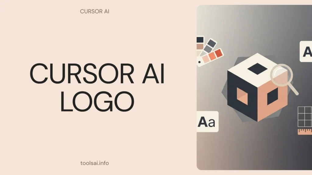
The Cursor logo consists of two main elements: a geometric cube mark and a wordmark, available separately or combined. Anysphere introduced the editor publicly in 2023. The visual identity has stayed consistent since launch, with no major redesign or rebrand along the way. That kind of early consistency is unusual for a fast-growing startup. It’s helped the brand build clear recognition in a short amount of time.
Cursor’s official brand guidelines list the full logo in several formats:
- Lockup style: horizontal (the preferred default) or vertical
- Standalone elements: the cube mark alone, or the wordmark alone, for situations where the full lockup doesn’t fit
- Dimensionality: 2D as the default version, with a 2.5D variant available for larger applications like signage or big-format displays
- App icons: available in 2.5D (default), 2D, and 3D versions, each in both light and dark variants
- Avatars: available in 2D (default) and 2.5D, in both light and dark versions, formatted for either circular or square use
Cursor’s Brand Colors: What’s Actually Confirmed
Here’s an honest caveat worth including rather than glossing over. Different third-party brand-asset sites report conflicting color information for Cursor. Some describe a warm, minimal palette built around off-white backgrounds and deep charcoal tones. Others describe a more vibrant gradient treatment in parts of the visual system instead. These figures come from automated scraping tools, not a publicly listed hex-code spec straight from Cursor. Check cursor.com/brand directly for the current, authoritative palette rather than trusting any single third-party summary, including this one.
Where to Download the Official Cursor Logo
The most reliable source for logo assets is cursor.com/brand, Cursor’s own official brand page. It hosts the current logo files, app icons, and avatars in their approved formats. Getting assets directly from the source sidesteps two common problems with third-party logo aggregator sites: outdated files that miss the current brand, and resolution or format issues from re-uploaded, non-official copies.
Third-party brand-asset directories, like Brandfetch or Logo.dev, also index Cursor’s logo. They can offer quick access or API-based integration into your own tools. Treat these as a secondary option, though, since they pull from public sources and may lag behind updates the company makes directly on its own brand page.
Cursor’s Logo Usage Rules
Cursor’s brand guidelines lay out clear restrictions on how you can use the logo. Skip altering its colors or adding effects like shadows or glows. Avoid stretching, squashing, or rotating it. Keep it off busy or patterned backgrounds that hurt legibility. Leave its components in their original arrangement, and don’t use only part of the mark unless official guidelines specifically allow it. Finally, rely on real assets from the brand page rather than recreating your own version or grabbing unofficial, low-resolution files.
A consistent, correctly reproduced logo protects brand recognition. Altered or degraded versions do the opposite: they dilute it and create confusion about what’s actually official.
Frequently Asked Questions
Is it called “Cursor” or “Cursor AI”? Officially, just “Cursor.” The company’s own brand guidelines specifically state not to refer to it as “Cursor AI” or “Cursor Code,” even though many people search using those informal variations.
Where can I download the official Cursor logo? Directly from cursor.com/brand, which hosts the current, approved logo files, app icons, and avatars in their official formats and color variants.
What are Cursor’s official brand colors? Different third-party sources report this inconsistently. For the most accurate, current answer, check cursor.com/brand directly rather than relying on a third-party color extraction tool.
Can I use the Cursor logo in my own content or app? Generally, yes, for accurate representation like reviews, comparisons, or integrations. Just follow the official usage guidelines: keep colors unaltered, avoid distorting the shape, and use official files rather than recreated versions.
Has the Cursor logo changed since launch? No significant public redesign has happened since Anysphere introduced Cursor in 2023. The visual identity has remained consistent, which is fairly unusual for a company that’s grown this fast.
Bottom Line
The Cursor logo is a geometric cube mark paired with a wordmark. You can find it in multiple formats and dimensional styles directly from cursor.com/brand. One thing worth remembering beyond the visual details: Cursor’s own guidelines ask people to drop the “AI” and just call it Cursor, a small but telling detail that most content covering this exact search term misses entirely.